Do you remember in your early days of school, when a box of crayons was your ultimate creative freedom?
Well designers in the digital era, don’t have to stick to the limitations of the traditional methods of design & expression, but in saying there there is always a lot we can learn from fine art’s approach to color. Your eye can distinguish millions of different hues — but some days, even choosing two or three to use from these can seem a little daunting.
Why does that happen? Well choosing colors can be both highly subjective & at times scientific. So what does that mean for designers who just want a color palette that looks nice & is effective? Believe it or not, the most effective color selection goes beyond just a personal preference — as color has the extraordinary ability to influence mood, emotion & perceptions; can have cultural & personal meaning; and command attention, both consciously & subconsciously.
For designers, the challenge is to balance these, in the creation of stunning, effective designs. Awareness of this is where color theory can come in very useful. Traditional color theory can help you appreciate which colors work well together (or not) & what effect different color combinations will create within your design.
The color-wheel is where it all begins …
The Basics: Understanding Color
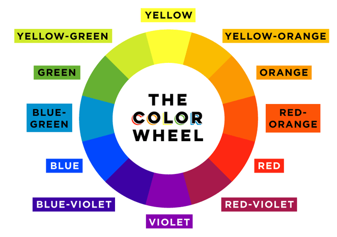
The Color Wheel
You may have seen it in an art class, or at possibly familiar in its stripped-down form: primary colors of red, yellow & blue. The best way to begin is with the traditional 12 color wheel, often used by painters & other artists. It provides an easy visual to understand color relationships.
more to come
Continually updated & living article
Coming Soon
I will be looking at areas such as Color Inspiration, Psychology of Color & Color in Design.
I will also open up the opportunity for input, collaboration & points of view in the future.